iPad 2 Case GIVEAWAY !!!!

UPDATE : Giveaway has ended.

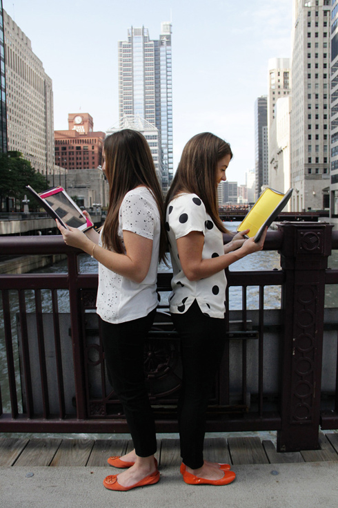
This Friday I'm bringing you something pretty cool....I'm sure many of you know JESS LC & all the cute jewelry she sells via her shop right?!!? However, did you know she's designed some really cool Leather iPad cases?!?!?! Oh yea, these things are colorful & stylish! 

To launch these cool cases - Jess has offered to GIVE one away to a LUCKY Made By Girl reader! The one we're giving away is the GOLD + Fuchsia & it's totally HOT!! HOT! HOT!!

To ENTER:
Leave a comment letting me know why you want to win.
Tweet about the contest & let me know.
Leave your EMAIL in the comments or make sure it's in your profile.

1 WINNER WILL BE CHOSEN TO WIN:
The Gold + Fuchsia iPad case

iPad CASE INFO:
Designed for iPad 2 ONLY
Soft, supple cowhide leather exterior with padding protects the iPad
Bright colored lining with brass zipper closure
Interior has pockets for papers, business cards, and a pen/stylus
Hole on top of the iPad upper strap made for iPad 2 camera
New, improved binding keeps things fresh and crisp (shown here)
10.5" H x 8" W x 1" D
Made in Chicago


WINNER WILL BE CHOSEN ON: 
October 10th, 2011

You can WIN one of these Gold on the outside & fuchsia on the inside cases!


Check out the rest of the colors available on the JESS LC site!


Good luck!!!!!!!!!!


-images by danielle moss

Google+ Pinterest

Ponchos For the Fall....

Fall is officially here & I CAN'T wait to wear all my boots & blazers. This FALL I'm looking to buy a poncho for my upcoming trip to NYC at the end of October.

I don't know about you...but I remember back in the day I'd spot someone wearing a poncho on the street & think - "who the heck wants to wear something that looks like a bag??!?!!?!?!?"  

Guess what.....Now I WANT to wear this bag! 
 
Amazing how things change no? I've rounded up 10 of my current favorite ponchos for this FALL season & here they HOT!!


So tell me ladies....do you own a poncho? Can you see yourself wearing one this season??


Google+ Pinterest

Accessories at Burke Decor

After thinking so much about accessories..... I decided to pull together my favorites from Burke Decor.

I SERIOUSLY thought about buying two of these Barbra Cosgrove horn lamps for the floating shelves - you know, placing one on each side. However, I decided NOT to spend a TERRIBLE amount of cash on accessories just yet!  If I change my mind, I'm sure you'll know! 


Have you purchased items from Burke Decor? What was it?


-images via burke decor


Google+ Pinterest

Accessorizing....

This past weekend I went out & purchased a few items for the floating IKEA cabinets I posted about here.  


I read ALL of your comments & suggestions on what I should place on the shelving & believe me, there were lots of good ones, so thank you!!!! Many of you has suggested adding lamps - but it isn't wide enough for a decent sized lampshade...& I didn't want to get mini-lamps, so I scratched that idea. Here's what I added...

I wanted to keep it relatively simple....but I think I may pile a couple more books on each side for more height....


The flowers are silk flowers I purchased awhile ago, don't recall where (sorry) but you can find them online I'm sure! They feel really nice & I love how they look in person! The white vase the flowers are in is from West Elm.


The little white vase pictured above is from ZGallerie. It's so cute & lightweight, can easily be moved around the house.

This polished brass vessel (below) holds a black candle from D.L. & Co. that is one of my favorites! Isn't the skull super cool?? The scent of the candle is made up of opium poppy, a blend Madagascar vanilla, green pepper, pink lotus, and perilla absolute. It is just amazing! Available at Barneys New York.


I've always wanted a piece of driftwood & instead of hunting for it myself in some town or buying it on Ebay, I decided to buy the one I saw at ZGallerie. It was perfect & super affordable at only $25!


All the books I have on a flat display are:


World Art


So, what do you think so far?


-images by jen ramos


Google+ Pinterest

Feeling Better...

Sorry I wasn't around yesterday- but I hope everyone had a great weekend! 

A lot of you thought that I was SICK- as in a COLD...but in reality my back got hurt. 
 
While vacuuming my bathroom yesterday with a dirt devil, I leaned over & then got back up & BAM!!!!  O-M-Gosh....my back felt like someone had punched it!!!  I needed to lie down right away!  So, I was in bed most of the day yesterday & now only have a minor pain to my right when I move too fast.  I remember how I used to (back in the days) take my health for GRANTED - not anymore!  These days I thank God for another day of life that I get to enjoy with the people I love (& doggies too). 
 
When I feel sick I pray for better health & try not to complain or be grumpy - because I know there is always someone out there who is worse off than me. 

So today I am more than grateful for my health & the 'get well' comments that were left & emailed to me, THANK YOU.


Isn't it a pain in the neck growing OLD ???  Well, my guy (who works out often) immediately told me I have to strengthen up my core muscles asap... so that is what I intend to do!
Google+ Pinterest

Floating Cabinets Are Done....

Thank God Friday is finally here - aren't you glad?? Today's post is about a DIY project we worked on in our home. Check it out....

So after my master closet was done, we decided it was time to tackle the dining room area. The wall across from the table looked TERRIBLY lonely & sparse. I'd been on a SERIOUS & frustrating hunt for a sideboard & came up with nothing every time! Well, I won't lie, I found a few, but they were well OVER my budget! 

After seeing this post on Apartment Therapy, I thought it would be a great idea for our space! So, we tried IKEA!

CABINETS

Ikea Akurum cabinets 36" wide x 24" high with white high gloss Abstrakt doors.

We placed them 8" off the floor. The IKEA rail system needed at least 3 stud screws with 3 toggle bolts in addition. Total dimensions are 12' x 24"H x 13"D.  We also had end caps but decided not to install them because the ends were close enough to the walls.


PULLS:

I decided that instead of using standard IKEA pulls or knobs .... I was going to try something different.  Something that would give it less of an IKEA look & more of a high-end feel. I found the perfect pulls while reading Erika's kitchen renovation post. She's got such great style that I didn't even question it & purchased them via myknobs.com.  I bought 8 brushed brass pulls for a total of $61.  So, what do you think?? 


TOP PIECE:

As some of you know, these cabinets have annoying & visible screws at the top - so we had to figure out a way to cover them... They're ugly. We went to a local lumber yard & bought a 13 foot x 14" piece of poplar with no visible knots & had it milled. Cost of the wood - $28. The depth had too much overhang so my guy VERY carefully trimmed the back with a circular saw to give us a 1/8" overhang.


FOR THE WOOD STAIN:

We used a mixture of Jacobean and Ebony Minwax stain (in all, we only used 2 small cans) to give it a brown-black finish. Remember to sand it before and between all coats. A third/final coat we used an Antique Walnut Minwax Polyshade (thin layer of polyurethane) to give it a protective finish. The top is glued and screwed (remember to use ones that won't pierce the top) to the cabinets.


BEFORE:


AFTER:


MY COMMENTS:

My guy was amazing- he managed to build the entire thing & make it look flawless. 

One ISSUE.... The entire piece stretches about 12 feet long. Soooo guess what!!?? I'm at a LOSS for what kind of accessories to put on top?!? All I have is books & a vase, but I'm open to suggestions. Any ideas?!?!?!? Pls help!


-images by jen ramos


Google+ Pinterest

Nursery Design Series....

Check out the little NURSERY design I put together for Chassity over at Look Linger Love blog! 


She's PREGNANT with a little boy & looking for some inspiration for her nursery! She asked 5-6 bloggers to contribute to her 'Nursery Design Series' - and sooo I did! 

Check it out here & leave a comment on her blog letting her know what you think! 


Google+ Pinterest

Shalina's Modern Vancouver Home Tour....

Every so often I get an email of a home that just blows me away.....& this one is definitely one of them! 

 The owner of this ROCKIN' home is Shalina Lawrence, she's also a customer of mine who bought 9 Love Prints & displayed them in such an interesting manner - I had to ask her if I could see the rest of her home! I'm so glad I did!

Can you believe this place!?!? 
 
This is the first pic she sent me of the displayed Love Prints at the landing of her staircase...genius!


her home office....


That looks like driftwood on her dining table....I love driftwood, but it has to be a nice cut piece like this one below!


What a dream kitchen right?? ...and it's all white...amazing!


Do you spot the display of Love Prints at the landing of her stairs??? Wowza!


Shalina also owns my Love & Hello Language prints - see below!


Thank you Shalina for sharing your home with all of us!


-all images belong to shalina lawrence


Google+ Pinterest