Hey everyone!
So, we moved to another apartment a couple months ago & I finally finished decorating a couple of the rooms! The main space I am sharing with you today is of our living room/dining area. This is where we spend most of our time
reading, hosting friends or watching a movie! To be honest, I was SO tired of the previous decor
here - that freshening things up made sense! The new apartment is still a 2 bedroom but it's actually SMALLER than our previous place. Smaller or not, I really think I made it flow quite nicely for our family.
This time around, I opted for more contrast patterns with a few hints of pink. You're probably wondering.....why PINK?!?? I know, I know.....well, it's not the first color people seek out when they're decorating but I really wanted a SOFTER tone that felt a bit more relaxing. Plus, it won't make the space feel dark & small.
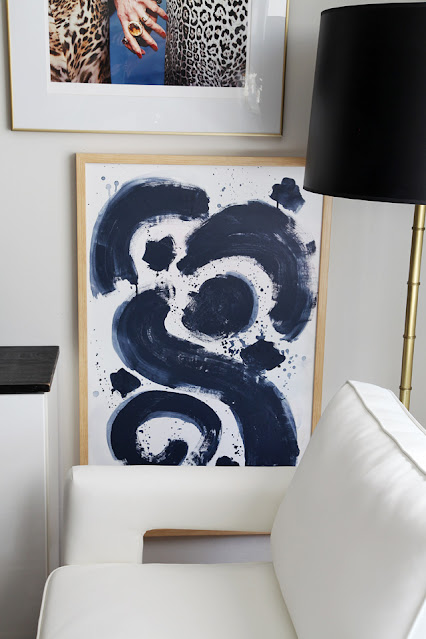
As for the pink, I ended up incorporating it with two pieces of artwork. Both pieces (
which I painted) had very subtle tones of pink. The first one is the LARGE scale artwork behind our sofa. This piece was inspired by a
beautiful vision God showed me with 4 BIRDS. It has a very special meaning to me. I saw these four birds from our bedroom window & even though the sky was blue that day, I decided to place the birds against a pink sunset sky. I also decided I wanted a
busier-looking rug so I chose the
Linden Outdoor Rug patterned rug from
Frontgate which provides lots of interest & contrast to the living room. Although it says outdoor, it can DEF be used indoors! Don't be fooled, it is soft & comfy just like any indoor rug. I always choose the thickest rug pad I could afford for all my carpets because I prefer a more
cushion-y feel!
It seems that with EVERY single apartment I've decorated - I was always drawn to adding a rectangular or square table. However, this time I really wanted to make the most of the space. Because we have a 2 1/2 year old boy - space is essential. My son was basically the deciding factor on getting the round coffee table, and we are SO glad we did!! It gives our family a lot more leg room & in a smaller apartment - this is a WIN!!!!
Although there were many round coffee table options & it took me three days to decide, I finally chose the
Hammered Metal Accordion Coffee Table by
West Elm. It is a metal-wrapped engineered wood table in an Antique Brass finish! It's got a nice gold brass finish to it without being so bright & tacky. It's not too low & its a great solid piece that cannot be easily tipped over.
Ideal if you have kids.
Below you'll notice that we kept our
IKEA floating cabinets that we made awhile back, see post
here. Anyway, we shortened it to fit our current space by removing a couple cabinets & then added legs to it for a more GLAMOROUS look! The legs we got are solid, with a brushed gold finish which we purchased from
Balasagun - an overseas company that makes
custom metal pieces for furniture in a variety of finishes! The legs we chose are 8".
Plants are not my specialty. Although I love them, I am just not that skilled in caring for them! Because of that I decided to get a faux tree......something that was large & realistic-looking. I knew I had to invest a little money for that type of plant, so I went with the
Majestic Fiddle Leaf Fig Tree from
Houzz which also brought it's own Seagrass basket!
The luxurious candles like the skull & the Back Elephant (
which smell so good) are by
Thomas Ferrier NYC - they have a wonderful selection of scents and high-end candles with some unique designs that I really like! Many of their candles are available in a variety of finishes like gold, black & more!
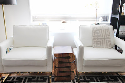
As for the side chairs - I was debating back and forth whether to get
white or black leather chairs - but in the end I chose WHITE because it made the space appear larger & more open! Because they are leather.... they are easy to CLEAN, so I'm NOT worried with my son. He knows he's not supposed to eat on them, although he tries to sneak food there every now & then! The White chairs are by
All Modern - you can get them
here.
The lovely Grey Cotton Knit Jacquard throw over the white armchair is by my friend
COCOCOZY.
This throw is so soft & comfy!
We decided we didn't want to have people staring into the living room the minute the front door was open, so I thought of a creative way to block some of the view by using this tall
Parsons Tower from
West Elm and filling it with books to make that happen. we anchored it safely into the wall - so now it's super sturdy and my son cannot tip it over.
Remember safety always with children!
Cushions are so important when decorating. I've had so many people tell me how they are really bad at selecting different cushions and how they end up settling for 2-3 solid colors. I know how they feel! Selecting a variety of patterns for a sofa can be very challenging but I tend to select one common color among all the pillows (
in this case black) and then choosing patterns I feel compliment each other.
Trust me, we don't all have the same tastes and my selection may not appeal to some people. But the key is to make sure YOU LIKE IT! So unless you're competing in a design contest or posting it on your blog etc......
make sure you're happy with it!! I love how different the cushions are but how well they feel together!
I ended up keeping a few cushions from before but I selected new ones from a shop called
Stuck on Hue. The owner, Hollie has a great selection of chic-looking pillows and so I went with these:
Dining chairs are from West Elm - but no longer available. The Marble tulip dining table can be purchased
here. We have the 40". Art by Jen Ramos via
Made By Girl.
This Swerve End table is one of my favorite pieces of furniture in our living room. It is nestled between the two white leather armchairs and it really warms that area. This table is sturdy and heavy......the color is beautiful and rich. We got ours from
Houzz, but you can also get it
here at
HayNeedle.
After recently spotting this bench in the
one room challenge - I fell in LOVE!!! - I realized I had seen it before but not in a room setting.....& that made all the difference! Thanks to
Candelabra - it's now part of our decor! It comes in
3 different colors, red, wood & black! It is delivered with a linen upholstery but can easily be
re-upholstered in any other fabric to suit your families needs!
Below was the original plan I put together, as you can see..... it developed slightly different! I'm def happy with that final outcome! Stay tuned for next week when I post pics of my son's room!
RESOURCES:
thanks!
-images & post by jen ramos

